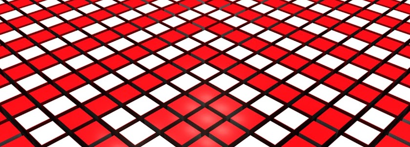
These are 2 tests I produced to show on the Monday before hand-in. Here I played with creating the tiles, projecting the footage on them before rotating the tiles to reveal the text. As a first test it worked well as I got a lot of feedback to improve the piece. The final composition will look quite a lot different to this but that shows that these did there job.
I also had the opportunity to experiment with sound. I have been given some tracks by the Pepsi run competition to use and I experimented here with 2 possible choices. The is one rock track which feels like it is out of the 70/80's and an up tempo techno track. After talking with peers I think the techno track works best as it helps show the busy nature of the piece with multiple things going on.
Test 1
Test 2
The feedback I got from my peers was that it was hard to see so hard to follow. Because of this I have decided to look at making the tiles bigger and reducing the vignetting used on the footage to make each piece of footage easier to view. It was also mentioned that the tiles looked more like holes to start with so I need focus on making the tiles look more like tiles and show how the interact with each other. I have 1 colour running through each line of film and it was suggested that the colour of the text should emphasis this and tie the piece together.
With all this feedback I realised I have a long way to go with this piece for my final piece and with a reshoot that is supposed to be taking place on Wednesday I have a busy week ahead.

No comments:
Post a Comment