Showing posts with label Competitions 2010. Show all posts

Saturday, 18 December 2010

Old Footage Tutorial

After my feedback from my testing I looked back to what I really wanted to do with this piece. I was not happy of the grading of my film. It just made the footage look darker than it needed to be and it was hard to see colours that separated the sequences. I found this tutorial on making your footage old:

http://www.videocopilot.net/tutorial/old_film_look/

This was a great help showing a more convincing way to make my footage look like it had been taken on a 16mm camera. I wanted this style because of the Plus Guest piece I posted earlier. This has enabled the colour filters I put on the footage to be a lot more visible, plus they also work as vignettes on tablets.

Tuesday, 14 December 2010

New Composition

After the feedback I got on my tests I have come up with this as my final composition. I have used the idea of an abacus with the tiles on the bars. This would be the final shot of the animation after the tiles have rotated. I think the shadows really help show that each square is a tile as opposed to a hole with footage behind. I have also changed the colour of the type to relate to the footage in each row. I think this has worked well and after softening the shadows and reshooting some of the footage I will be ready to render.

New Composition

Tiles Research

One of the main pieces of feedback yesterday on my tests was that the tiles didn't look so much like tiles and more like holes. It is because of this I am really focusing on this to see how I can change the piece to show the tiles. When experimenting with the tiles to make them more obvious I began to think of other tiles. Immediately Scrabble jumped out in my mind. These tiles are iconic but as this photo shows underneath the reason they look like 3 dimensional tiles is because of the shadows around the tiles which give them depth. This shows I need to experiment with lighting to show the individual tiles.

Scrabble Tiles

I also thought about the movement of the tiles at the end of the piece. They rotate to reveal text on the rear of the tiles and I think this needs to be emphasised. When considering this I thought how could I show that the tiles are in sequence and show that they all react with one another. For this reason I have decided to experiment with the idea of an abacus to show the formation of the tiles and have them spinning on bars as it is a piece that can be interacted with.

Abacus

Monday Presentations

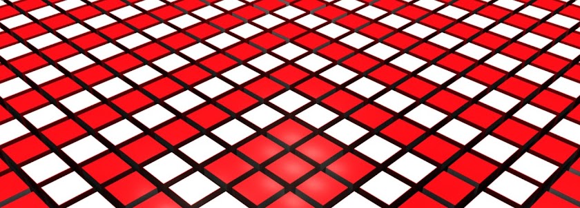
These are 2 tests I produced to show on the Monday before hand-in. Here I played with creating the tiles, projecting the footage on them before rotating the tiles to reveal the text. As a first test it worked well as I got a lot of feedback to improve the piece. The final composition will look quite a lot different to this but that shows that these did there job.

I also had the opportunity to experiment with sound. I have been given some tracks by the Pepsi run competition to use and I experimented here with 2 possible choices. The is one rock track which feels like it is out of the 70/80's and an up tempo techno track. After talking with peers I think the techno track works best as it helps show the busy nature of the piece with multiple things going on.

Test 1

Test 2

The feedback I got from my peers was that it was hard to see so hard to follow. Because of this I have decided to look at making the tiles bigger and reducing the vignetting used on the footage to make each piece of footage easier to view. It was also mentioned that the tiles looked more like holes to start with so I need focus on making the tiles look more like tiles and show how the interact with each other. I have 1 colour running through each line of film and it was suggested that the colour of the text should emphasis this and tie the piece together.

With all this feedback I realised I have a long way to go with this piece for my final piece and with a reshoot that is supposed to be taking place on Wednesday I have a busy week ahead.

Thursday, 9 December 2010

Text testing


This is the initial text test I have done. On the rear of the tablets/screens are letters that make up the sentence:-

"Why not make a change?"

This line is to interact with the audience. After seeing this I want people to think "why am I doing the same thing daily", why not change a curtain part of your life and who knows what else you could change. I have also rendered an occlusion layer to create more depth to the 3D text making it really jump off the screen to the audience. This will also give tho whole piece great depth as the tiles revolve.

Textured layer

Occlusion layer

The test below is just experimenting with the sentence turning and appearing on the back of the screens. The footage is more test footage I used just to show the general idea of the screens and you can also see here how well the vignette effect works. The footage does not have the vignette on it here, it is actually the light in maya that creates this effect. I prefer this method as the lights can stay in place to light and soften the text as it revolves also creating depth when they cast shadows.


Grading Tests


This is my first test with grading some footage. This is a sequence from an early project and I wanted to see if I could create a vintage look. I have ended up using some scratched textures and and feathering some plastic textures to create these results.

Plastic feathering

Scratches texture

I wanted to end up with footage that looked like it had been through a lot and found after being neglected for a long period of time. I think it has worked well. I have not added the vignette as the lighting in the final maya piece creates the it on each tile individually.


This is my next test with the same footage but I wanted to try it with the intro and outro footage given. These I have to add on the 1 minute final outcome which leaves me with just 49 seconds to play with. I have also been supplied with music tracks I can use so I need to find the one that best goes with my fast paced piece. This is the next area I need to bee looking into.

Vignette Technique

Looking at previous research I have conducted, I have found that a lot of the vintage footage had a vignetted look. This is best shown using this image below:-


This is a technique I want to use in my piece as I believe it ages a piece well when combined with grading the footage. This can be done in After Effects post-production once the footage ha been collected. I can radial feather a layer produce this kind of effect. I need to se if it darkens the edges of the tiles too much that they blend into the background which is not what I want to happen. Now I will start to play with textures to produce a scratched and abused piece of footage.

Footage style frames

These are my initial tests for my footage for my final piece. Here I got some photographs and framed them up as I wanted them. I played with colour layers over the top as filters to change the mood and composition. I have tried to use a vignetting technique as well to produce similar results to the "Plus Guests" piece I put on my blog earlier.


Style frame 1

Style frame 2

Style frame 3

Tuesday, 23 November 2010

Morning sequences

After looking at the Dexter sequence I looked further into morning sequences and wanted to look at how a small change to your morning routine could change the rest of your day. One thing I need to ensure is that the change be an obvious one so that the rest of the animation makes sense. I have only got 49 seconds so it need to be clear with my idea and communicate it well.


Dexter Opening Titles

This is the opening title sequence to the american series Dexter. As I highlighted in my sketchbook I want my piece to be an everyday sequence which is being deferred from. I started watching this series not so long back and found that this is one of the most memorable title sequences around at the moment. It focuses on the idea of relating everyday tasks or activities to one that a serial killer would perform. This is a very clever technique to use as it shows the normal front the character portrays and his hidden motive as well as setting up the audience for the drama they are about to witness in a non graphic manner.


Because of this sequence I had decided I want to use a typical day scene where a change is made and then everything thereafter changes as a result. The whole point in my piece is to encourage people to make a change, no matter how small, to create change in there lives. It may even leave to something good. For now I am going to focus on the morning sequence and getting ready from work.

Monday, 22 November 2010

Harold and Kumar, Lift Scene


Watch 5:15 to 7:15

When thinking of decisions that could be made the idea of taking the lift or the stairs, or in fact the time you take it all stemmed from this scene I saw a long time back in "Harold & Kumar Get The Munchies".

The only difference is that in this scene Harold is daydreaming rather than it being on 2 separate occasions. I like this idea that the fact you say some thing when you usually wouldn't could not only affect your life but also the person you were speaking to which could have a knock on effect creating a huge chain of events. This could be the one change that has made the change in the sequence. From here I need to look into other possible changes that could be made to see if there is a better one I could use that would be more obvious for the audience to work out in the time scale.

Cold Water, Frances


This is the music video for Cold Water by the band Frances. They have used multiple screens throughout the video filming the same shots in separate locations. Afterwords these were edited together to create one composition. It works better because of the fact that the colour palettes of each shot/location are contrast. I like the fact similar framings were used to connect the shots together to create a seamless sequence. This is a technique I could use for my final outcome to link my 3 sequences together. This may be harder to do with 3 separate sequences but I think it is a technique I want to try.

Lie To Me: Faces Promo


This "Lie To Me" promo uses multiple screens in a different way to other examples I have been looking at. I reminds me of the children's books you used to get where you would try and match up all the segments of a persons picture. I especially like the way the screens flip to change what appears in each section. I also like the way the light and focus creates darker footage towards the corners of each section. This creates a lot of focus and depth to the faces and would be ideal in my small compositions.

Even though my ideas have moved on I would like to still include some text in the piece and after seeing this I have had the idea of the screens flipping and the letters of the word being on the rear of each section. Where the spaces are between words some of the screens could stay still playing their loops therefore tying the whole piece together. Some test need to be done as I only have limited time to fill.

Split screen colour patches


This is a short video by a band called "Plus Guest" for the track "My Horse Died In The River". It is exactly the style I'm looking for. The colours, the rounded screens and the grainy footage all remind me of footage from the 70's and would be a fantastic way / take on the multiple screen concept. The rounded nature of the pieces of footage remind me of the lighting I used in my last piece and I think it makes the footage more audience friendly.

For my piece the idea is each screen / each shot is of a different decision being made. This will show how decisions are made everyday and I am trying to get the idea of changing peoples routine and trying something new across to the audience. Having different filters on the footage could help when creating the text at the end of the piece which emphasises this message I am trying to convey. I will have to try some techniques and tests to get some similar feel to my footage.

Split screen


This is a short split screen student project which is of a person doing the same thing in a town square but on each screen it is shot from a different angle. I like the idea that all the screens connect together which means the piece flows constantly. This continuity between frames is just what I need in my piece. I now need to look at other split screen examples to see what other techniques I could use in my final outcome.

Split screen in 24

This is the example from my sketchbook of the split screen used in 24. The example in my sketchbook is quite dark and hard to explain but I love how the multiple screens come into the composition. They fill the screen making it busy to watch but it also raises the excitement of the viewer. It is very much like a crescendo which is building and building until it is stopped by the clock at the end. It leaves the audience guessing. I like the busyness of the piece and the building of excitement and hopefully I will be able to do that in my piece.


This is the cast and production team talking about the split scree device and how it came about. It is interesting how it came out of just experimenting with phone calls to being used as a great device of showing simultaneous activities. This could be perfect for my piece as I want to show 3 journeys simultaneously.

COI Sexual Health Ad, Mainframe


As I was looking at Mainframes work before I go on my studio visit with them I found this. Well I had seen this before but had no idea it was made by Mainframe. This Is a great piece to look at in relation to my current project. I've been looking at using 3 dimensional text within a live footage composition and this is just that but doing it in an interesting way. It is recording peoples conversations without seeing the actual people which makes it less personal but something the audience can react with alot better considering it is regarding Sexual Health. This is one of my favourite adverts out ad the moment. Not because of the content but because of the way its done. Its just not the same as anything else I have seen recently even though matchmoving is starting to be seen everywhere.

Dexter Kenetic type Ad, 13th Street

When looking at using type in composition I had to look at using kenetic type as it plays such a large part in todays advertising world. This technique could be used in a composition I make but combined with the use of 3D text. This could make for a really good piece as I can't remember ever seeing a piece like that. This is another direction in which I could look to take this project.

Sky Arts Breakdown


This is the ident for Sky Arts that has been broken down into its separate stages. I like the way this has been shown. It shows how they got from just having the footage to the final outcome they have produced. This would be a good method for a making of, showing how the piece had been improved and made in stages. If this is the way a professional company shows their working methods then it might aid myself to produce making of's in this way to show that I am with the times and a contemporary designer that can work in today's industry.

Channel 4 Idents

I put these up for the same reason I put the Sky idents up. These are iconic idents that has created the image for Channel 4. These use CGI in a subtle way to create the the 4 in a split second in the ident. I think these work well because of the tension they build up before the quick reveal of the number. The satisfaction the audience get from seeing the for is why these are so popular. The viewer is glued to the idents until the reveal. The ads aren't tied to any programs in particular which means they can be used at random between programs giving the channel much more freedom.