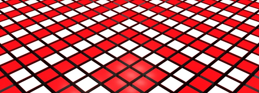


These were my entries into the JDO branding competition. The brief was to just use the lettering in the typeface provided to create either a moving or series of stills that can be used in a poster campaign. I wanted to use bright colours to emphasis the letters so they would stand out on a display somewhere. I was unsure whether to use full colour reflections or darker versions so I sent of both versions. I created a curvy almost liquid type surface for them to be stood on to deform the reflections and create more interest in the composition. Unfortunatly i found out this morning that I was un succesful in reaching the finals but I thought I would put them up here because I am still quite happy with them.
No comments:
Post a Comment