Friday 31 December 2010

Andrew Brooks Talk

Earlier in the year I went to a talk at the Whitworth Art gallery by Andrew Brooks. Andrew Brooks is a graduate from our college and has gone on to be a very successful photographer and digital designer.

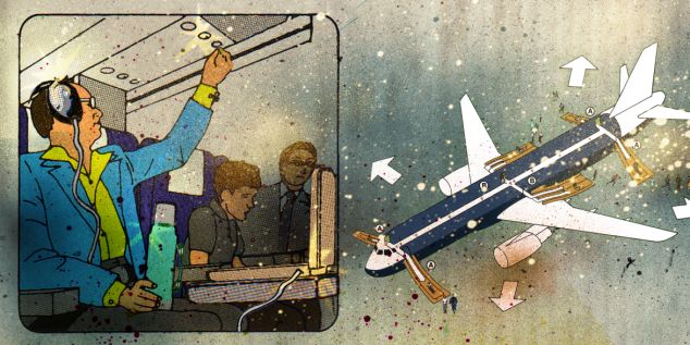
He started by showing us some pieces of work he had produced like this piece below:


He then went on to break down the image in photoshop to show how he had composited it all together. It was fascinating to see his layers after layers of changes. He explained how he takes hundreds of photos and selects areas to use in the final composition. His aim is to create seamless pieces of work that could be an actual landscape isn't. It was great to see how he worked and the fact he broke it down for us like this was great as you can actually see on screen the way he has produced it.

He went on to speak of how he likes to try new techniques and over the last year or so he has been testing with making 3D films pieces. He made them as Cross-eyed pieces or alternatively you could view each screen with the corresponding eye. It only occurred after he had projected some of his work on a screen behind him how weird we all must have looked sat there cross-eyed admiring his work. It was great to see though and I had no idea a piece like this could be produced this easily. Since then I have seen this method repeated all over. There were screens set up like this in the Film Archives in Berlin and is also the method Stewart from the Neighborhood had used to create his 3D work. Andrew Brooks had put a lot of time and effort into buying and building his own equipment for his 3D filming but the results really paid off.


This has shown how artists and designers are having to move with the times and keep up to date with the techniques they are using. This makes me want to consider doing some 3D work in the future. I think I will if I have the time and resources available as that is the direction everything is heading into at the moment. Andrew also spoke about he he enjoyed being self employed and working whereever he wished. This made a lot of sense when thinking of the freedom you would have when moving around jobs and companies but I still can't help but think I want experience before I even start considering freelance. I want to get in the industry and see how it works before I take any huge steps like that.

Check Out his website if you have the time:

Thursday 30 December 2010

Museum of Film Archives

While in Berlin one of our tutors had managed to get us into the archives for the “Museum Of Film” where everything is kept when not on show in the museum itself. It was a bit of a mission to find the archive building but when we got there we found it was worth the wait. When we got there we were able to look around the 3 large rooms. The first had the opportunity to see some of the original artworks for a large range of films exhibited at the museum. We saw some of the original concept art from the film Metropolis that was filmed a Studio Babelsberg. These charcoal and pen drawings were beautiful and you could see exactly why the film ended up looking the way it did. These photo’s really don’t do them justice.


After these we saw some costume designs before some real surprises were shown to us. We saw and oscar that had been donated, the actual hook used in the film Hook and to finish with they showed us one of the model Gremlins used in the films.


After we saw these were entered the next room where there was reels upon reels of film. After these though was the real treat from the archives, which was all the cameras used in years gone by. The guides told us that there wasn’t a camera in there from post 1960’s.


To finish with we got the opportunity to see an original Lotte Reiniger piece of art with the silhouettes that made her famous. I couldn't believe how so much of this was in storage and not on show. We were so lucky to get the opportunity to go and see these but it seems a shame that it is all there behind lock and key. There are some priceless pieces of art there that should be really appreciated rather than hidden. We were convinced that some of the stuff we saw should have been in the museum instead of some of the things we saw but this just show how opinion driven our field is. Someone's love for a piece could be outweighed by someone's hate of it. I just hope this isn't the last seen of these pieces and more people get to be as lucky as we were.

Studio Babelsberg


When we arrived at the worlds oldest large scale studio Babelsberg we were greated by our guide and given a bit of information about the studio itself. It has been producing films and working as studio space since 1912. It has been the set for huge films such as Metropolis, Inglorious Bastards, Valkyrie and The Bourne Ultimatum. It offers services such as a replica Boeing plane with removable walls and cockpit as well as the worlds larges indoor water tank.

After we met our guide she took us to see all the separate areas of the studio. The studio is vast and the size of a town itself. Even the streets were names after famous directors and producers. We started by looking around the prop houses. It when you see all these behind the scenes workings you can truly respect the amount of work that goes into these huge productions. These prop houses were unbelievable, I have never seen anything like it. There was row after row of catalogued objects that could create or recreate any scenario you could think of. I couldn’t believe the work went into making the scenes.


After this we were shown the costume department and the rows upon rows of clothes and costumes such as military outfits all the way to cabaret. After spending our time trying some costumes on and looking through the vast collection we entered a room with the famous costumes in that the celebrities had worn. We saw costumes from Inglorious Basterds and Jude Law’s outfit from Enemy At The Gates. From here we went on to see the carpentry department and the plastering departments that created everything from huge ships to the mask used in V For Vendetta.


The last 2 areas we saw were the most impressive. First we went into the second of the 3 large filming studios where there was the some of the set left from the filming of The 3 Musketeers that had taken place there the week previous. This was by far the best part of the whole trip to Berlin! I cannot go into much detail as to what was inside the studio until the film is released as we said we would not reveal details but the set we got to walk around was unbelievable and the fact they had built it all from scratch. After seeing the rest of the studio I think I could finally understand what effort had gone into building it.

The last section we saw was at the other side of the studio and was a complete street that had been created on the side of huge containers that were stacked over 3 stories high. The street resembled a typical street and could be changed to directors wishes. It had been used in films such as Inglorious Basterds and the Pioanist.


All of this made me think of earlier in the year when I really wanted to get involved with film. Looking around all these separate warehouses showed that there are many areas in which you could get into the film industry. This just shows the amount of opportunities this studio has as well as showing the true scale of the place. I could be quite easy to get lost in the huge teams working together to create these scenarios but that is what this studio is all about. Everyone, every department are working with all the others to create one final outcome.

I am so happy I got the opportunity to see this studio. I made me think a lot of where I wanted to end up as it brought back thoughts of wanting to go into the film industry. The whole studio was fascinating but when I sit back and look I realised thatyet again it would be easy to get lost in the movie business and end up just doing the same thing over and over. I want to work on projects that I can see through until the end as well as working on the ideas rather than just being a production boy. This is the reason why I feel I would be best suited going into the advertising industry.

Saturday 18 December 2010

Old Footage Tutorial

After my feedback from my testing I looked back to what I really wanted to do with this piece. I was not happy of the grading of my film. It just made the footage look darker than it needed to be and it was hard to see colours that separated the sequences. I found this tutorial on making your footage old:

http://www.videocopilot.net/tutorial/old_film_look/

This was a great help showing a more convincing way to make my footage look like it had been taken on a 16mm camera. I wanted this style because of the Plus Guest piece I posted earlier. This has enabled the colour filters I put on the footage to be a lot more visible, plus they also work as vignettes on tablets.

Tuesday 14 December 2010

New Composition

After the feedback I got on my tests I have come up with this as my final composition. I have used the idea of an abacus with the tiles on the bars. This would be the final shot of the animation after the tiles have rotated. I think the shadows really help show that each square is a tile as opposed to a hole with footage behind. I have also changed the colour of the type to relate to the footage in each row. I think this has worked well and after softening the shadows and reshooting some of the footage I will be ready to render.

New Composition

Tiles Research

One of the main pieces of feedback yesterday on my tests was that the tiles didn't look so much like tiles and more like holes. It is because of this I am really focusing on this to see how I can change the piece to show the tiles. When experimenting with the tiles to make them more obvious I began to think of other tiles. Immediately Scrabble jumped out in my mind. These tiles are iconic but as this photo shows underneath the reason they look like 3 dimensional tiles is because of the shadows around the tiles which give them depth. This shows I need to experiment with lighting to show the individual tiles.

Scrabble Tiles

I also thought about the movement of the tiles at the end of the piece. They rotate to reveal text on the rear of the tiles and I think this needs to be emphasised. When considering this I thought how could I show that the tiles are in sequence and show that they all react with one another. For this reason I have decided to experiment with the idea of an abacus to show the formation of the tiles and have them spinning on bars as it is a piece that can be interacted with.

Abacus

Monday Presentations

These are 2 tests I produced to show on the Monday before hand-in. Here I played with creating the tiles, projecting the footage on them before rotating the tiles to reveal the text. As a first test it worked well as I got a lot of feedback to improve the piece. The final composition will look quite a lot different to this but that shows that these did there job.

I also had the opportunity to experiment with sound. I have been given some tracks by the Pepsi run competition to use and I experimented here with 2 possible choices. The is one rock track which feels like it is out of the 70/80's and an up tempo techno track. After talking with peers I think the techno track works best as it helps show the busy nature of the piece with multiple things going on.

Test 1

Test 2

The feedback I got from my peers was that it was hard to see so hard to follow. Because of this I have decided to look at making the tiles bigger and reducing the vignetting used on the footage to make each piece of footage easier to view. It was also mentioned that the tiles looked more like holes to start with so I need focus on making the tiles look more like tiles and show how the interact with each other. I have 1 colour running through each line of film and it was suggested that the colour of the text should emphasis this and tie the piece together.

With all this feedback I realised I have a long way to go with this piece for my final piece and with a reshoot that is supposed to be taking place on Wednesday I have a busy week ahead.

Thursday 9 December 2010

Text testing


This is the initial text test I have done. On the rear of the tablets/screens are letters that make up the sentence:-

"Why not make a change?"

This line is to interact with the audience. After seeing this I want people to think "why am I doing the same thing daily", why not change a curtain part of your life and who knows what else you could change. I have also rendered an occlusion layer to create more depth to the 3D text making it really jump off the screen to the audience. This will also give tho whole piece great depth as the tiles revolve.

Textured layer

Occlusion layer

The test below is just experimenting with the sentence turning and appearing on the back of the screens. The footage is more test footage I used just to show the general idea of the screens and you can also see here how well the vignette effect works. The footage does not have the vignette on it here, it is actually the light in maya that creates this effect. I prefer this method as the lights can stay in place to light and soften the text as it revolves also creating depth when they cast shadows.


Grading Tests


This is my first test with grading some footage. This is a sequence from an early project and I wanted to see if I could create a vintage look. I have ended up using some scratched textures and and feathering some plastic textures to create these results.

Plastic feathering

Scratches texture

I wanted to end up with footage that looked like it had been through a lot and found after being neglected for a long period of time. I think it has worked well. I have not added the vignette as the lighting in the final maya piece creates the it on each tile individually.


This is my next test with the same footage but I wanted to try it with the intro and outro footage given. These I have to add on the 1 minute final outcome which leaves me with just 49 seconds to play with. I have also been supplied with music tracks I can use so I need to find the one that best goes with my fast paced piece. This is the next area I need to bee looking into.

Vignette Technique

Looking at previous research I have conducted, I have found that a lot of the vintage footage had a vignetted look. This is best shown using this image below:-


This is a technique I want to use in my piece as I believe it ages a piece well when combined with grading the footage. This can be done in After Effects post-production once the footage ha been collected. I can radial feather a layer produce this kind of effect. I need to se if it darkens the edges of the tiles too much that they blend into the background which is not what I want to happen. Now I will start to play with textures to produce a scratched and abused piece of footage.

Footage style frames

These are my initial tests for my footage for my final piece. Here I got some photographs and framed them up as I wanted them. I played with colour layers over the top as filters to change the mood and composition. I have tried to use a vignetting technique as well to produce similar results to the "Plus Guests" piece I put on my blog earlier.


Style frame 1

Style frame 2

Style frame 3

Wednesday 8 December 2010

The Neighbourhood Studio Visit

The Neighbourhood Showreel 2010


After ringing the project manager Sarah Baker last week myself and 2 others went on a portfolio yesterday morning to The Neighbourhood's new design studio. After turning up at their new Lever Street Studio I instantly loved the new place they had just got for themselves. The building itself is fantastic as it has been modernised but still keeping some of the traditional elements of the build. When walking in the studio we were greeted by one of the designers and we sat in their waiting area while the creative director Jon Humphreys had finished in a meeting. From here we could see the studio and the fact they had just moved in the week previous as there were pictures ready to be hung and boxes to be sorted. Even though they had only been there a week they had already made the space their own by adding traditional furniture and creating a coffee table out of old books. This is one of the best studios I have been to as it felt like The Neighbourhood had a home. Some of the other studios I have visited have been quite empty and almost office-like, where as this you could tell they are a design company and they wanted to express that.


After a few minutes we saw the meeting room empty and Sarah (project manager), Jon (creative director) and Stewart (animator, designer and 3D enthusiast) come across to great us and introduce themselves. We then followed them into their new meeting room and sat around their huge traditional dining table. After looking up and seeing all along the wall the awards they had won from various competitions I knew I was in one manchester best design studios. We spoke to the 3 designers about our course and what it was we actually do. They were very interested in what we had to say and where we saw ourselves in the future. They asked where abouts in the country we saw ourselves heading after the course had finished and after we all showed interest of staying up north and hopefully at a design studio around this area they explained that that is where a lot of the business is moving and that we should definitely check out around here before venturing south.


You could tell that the designers liked how we spoke of our work and how we presented them our work. They expected us to take along disks and to use their Tv to show the work but when we said we had brought our laptops to show them our work I think they could tell we were making an effort to show what we were all about as individuals. After the others had shown their work we had a conversation with Jon about how we had recently produced showreels to show the work we had been producing over the last few years. He explained how they can sometimes do more harm that good and that it was important the amount of content you put in as you don't want them to seem repetitive and that a designer only does one way of working. After this Sarah, Stewart and John all looked towards me and I decided that I was still going to show my showreel I had produced. I am glad I did, they were all impressed by it and Jon mentioned he liked the fact I showed my working methods in there as well as my work. After this I showed them my Big draw ident and making of to explain how I put it together and the effort I went through to get the results I did. Also I wanted to show I could do a range of work from Maya to stop-motion. After this is explained the ideas behind ad showed my title sequence which I think went down well.


To finish with they showed us a piece of their work that Stewart had recently made 3D post-production. We all got handed the 3D glasses and were shown how the design world is changing and how ahead of the game The Neighbourhood were. They have been ready for some time for these types of jobs to come around and produce work of which I have never seen before. Stewart explained that making a piece 3D is something else he has just put in his toolbox much like other techniques such as using depth of field. After this we left as we had already taken up plenty of their time and they have deadlines to meet. It was a fantastic studio to visit and I hope one day I can work in a place just like it. The people were friendly, talented and just as passionate about the subject as I am which, is what I want when I leave. This is definitely a studio I will keep in touch with as I think they will be a great contact for the future and hopefully I will be able to go back again sometime.

Wednesday 24 November 2010

Sehsucht Studio Visit


When we went to Berlin this November we went to a Studio called Sehsucht Located to the north of the city. They are the newest Sehsucht office as they have a larger office in Hamburg.
The company was very welcoming but that was probably amplified because of how cold we were when we got there. We were greeted by the managing director of Sehsucht who had previously work at Psyop (a company we visited and I personally loved in New York). The studio space was very similar to that of Psyop and that is probably one of the reasons I liked it so much.

This is the piece the studio had recently finished. While we have had street view on google for some time, out there they have not so this is a campaign to advertise what it is. We had all seen this before we headed out there but when we arrived the managing director had a breakdown of how they put it together (which is underneath). He walked us step by step through the process of making before we were shown the studio where they had filmed it. All the props were still out from filing and we were very impressed with the results they managed to get in such a small space.

Google Street View Ad


Making of Google Street View Ad

After our meeting we were aloud to walk around the very friendly working studio speaking with the designers and I managed to show one of them my showreel which he seemed impressed with. This was great but I was more taken aback by the stuff they were doing. They were showing us the work they were currently working on and how it was separated into sections between them. It was impressive to see the results they were getting and they all knew what everyone else in the team were doing and the stage they were at.

This was a great studio and I would love to work somewhere like this in the future. The small team meant you could work on a piece from start to finish. The team was separated in 2 though and I can imagine that there could be some rivalry. Im not sure if it could be healthy rivalry or not but that could be a concern. Other studios have everyone together which personally I think is better even if your working on different projects as you can bounce ideas and techniques off each other. After seeing this studio as well as the others I have visited I'm definitely sure I want to work in an advertising studio doing a wide variety of jobs.

Tuesday 23 November 2010

Morning sequences

After looking at the Dexter sequence I looked further into morning sequences and wanted to look at how a small change to your morning routine could change the rest of your day. One thing I need to ensure is that the change be an obvious one so that the rest of the animation makes sense. I have only got 49 seconds so it need to be clear with my idea and communicate it well.


Dexter Opening Titles

This is the opening title sequence to the american series Dexter. As I highlighted in my sketchbook I want my piece to be an everyday sequence which is being deferred from. I started watching this series not so long back and found that this is one of the most memorable title sequences around at the moment. It focuses on the idea of relating everyday tasks or activities to one that a serial killer would perform. This is a very clever technique to use as it shows the normal front the character portrays and his hidden motive as well as setting up the audience for the drama they are about to witness in a non graphic manner.


Because of this sequence I had decided I want to use a typical day scene where a change is made and then everything thereafter changes as a result. The whole point in my piece is to encourage people to make a change, no matter how small, to create change in there lives. It may even leave to something good. For now I am going to focus on the morning sequence and getting ready from work.

Monday 22 November 2010

Fisheye Test Berlin

When in Berlin on our final morning me and  group of friends decided to setup some photographs and play around with composition. These are some of the examples of the shots I managed to get.


Finally I had the idea to try filming in the fisheyes as when looking on the viewfinder while walking created great results. Because of the curvature of the piece of footage it makes it look as if I am walking on a sphere or globe of some kind. I really like how this looks and I would like to use this technique in a future project.


Harold and Kumar, Lift Scene


Watch 5:15 to 7:15

When thinking of decisions that could be made the idea of taking the lift or the stairs, or in fact the time you take it all stemmed from this scene I saw a long time back in "Harold & Kumar Get The Munchies".

The only difference is that in this scene Harold is daydreaming rather than it being on 2 separate occasions. I like this idea that the fact you say some thing when you usually wouldn't could not only affect your life but also the person you were speaking to which could have a knock on effect creating a huge chain of events. This could be the one change that has made the change in the sequence. From here I need to look into other possible changes that could be made to see if there is a better one I could use that would be more obvious for the audience to work out in the time scale.

Cold Water, Frances


This is the music video for Cold Water by the band Frances. They have used multiple screens throughout the video filming the same shots in separate locations. Afterwords these were edited together to create one composition. It works better because of the fact that the colour palettes of each shot/location are contrast. I like the fact similar framings were used to connect the shots together to create a seamless sequence. This is a technique I could use for my final outcome to link my 3 sequences together. This may be harder to do with 3 separate sequences but I think it is a technique I want to try.

Lie To Me: Faces Promo


This "Lie To Me" promo uses multiple screens in a different way to other examples I have been looking at. I reminds me of the children's books you used to get where you would try and match up all the segments of a persons picture. I especially like the way the screens flip to change what appears in each section. I also like the way the light and focus creates darker footage towards the corners of each section. This creates a lot of focus and depth to the faces and would be ideal in my small compositions.

Even though my ideas have moved on I would like to still include some text in the piece and after seeing this I have had the idea of the screens flipping and the letters of the word being on the rear of each section. Where the spaces are between words some of the screens could stay still playing their loops therefore tying the whole piece together. Some test need to be done as I only have limited time to fill.

Split screen colour patches


This is a short video by a band called "Plus Guest" for the track "My Horse Died In The River". It is exactly the style I'm looking for. The colours, the rounded screens and the grainy footage all remind me of footage from the 70's and would be a fantastic way / take on the multiple screen concept. The rounded nature of the pieces of footage remind me of the lighting I used in my last piece and I think it makes the footage more audience friendly.

For my piece the idea is each screen / each shot is of a different decision being made. This will show how decisions are made everyday and I am trying to get the idea of changing peoples routine and trying something new across to the audience. Having different filters on the footage could help when creating the text at the end of the piece which emphasises this message I am trying to convey. I will have to try some techniques and tests to get some similar feel to my footage.

Split screen


This is a short split screen student project which is of a person doing the same thing in a town square but on each screen it is shot from a different angle. I like the idea that all the screens connect together which means the piece flows constantly. This continuity between frames is just what I need in my piece. I now need to look at other split screen examples to see what other techniques I could use in my final outcome.

Split screen in 24

This is the example from my sketchbook of the split screen used in 24. The example in my sketchbook is quite dark and hard to explain but I love how the multiple screens come into the composition. They fill the screen making it busy to watch but it also raises the excitement of the viewer. It is very much like a crescendo which is building and building until it is stopped by the clock at the end. It leaves the audience guessing. I like the busyness of the piece and the building of excitement and hopefully I will be able to do that in my piece.


This is the cast and production team talking about the split scree device and how it came about. It is interesting how it came out of just experimenting with phone calls to being used as a great device of showing simultaneous activities. This could be perfect for my piece as I want to show 3 journeys simultaneously.

Mainframe Studio Visit


The week before last I went to Mainframes design studio in the Northern Quarter of Manchester and spoke to the managing director Chris Hardcastle. After walking to there studio on Silk Street and finding there attic studio I met Chris and sat with him at his meeting table. We started by talking about the industry and the kind of things I as interested in and the area in which I wanted to head. We spoke about how until a couple of weeks previous I wanted to get into to film industry and work on large projects but recently I had turned more towards the advertising industry. I mentioned how I wanted to see a project through as opposed to just being another cog in the works who ends up doing the same thing all the time. 


This is a screenshot taken from Mainframe's Huggies (For The Journey) ad


We spoke how he had done that when he was working down in London and that the larger Mainframe studio in Soho is more like that too. It was very interesting listening to him how there Manchester studio was a stand alone office or sister company as opposed to working on the same work in both offices. He was interested in where I wanted to work, whether down south or staying up in the north. I mentioned that I would like the experience of London at some point but would not be upset about staying up in Manchester or Liverpool if the opportunity came around. Chris mentioned how they are wanting to expand the business up here and are trying to keep designers up north as opposed to them all heading south. He mentioned a company called The Neighborhood which are their closest rivals and there main competition.


This is a screenshot from Mainframe's COI sexual health ad


After we spoke about the industry we moved onto my work  and questions I had. At the end of last year I asked Chris for a portfolio visit and unfortunately it wasn't possible because of the work they had on at the time. He did say I could send some work through to him and he would send me some feedback back. Because of this I didn't want to show him the same pieces so I showed him the new showreel I had just created (which included the 2 pieces to refresh his memory) and my Big Draw ident as well. He was very positive of my work and suggested some small tricks to improve my work and make me stand out from the crowd when it came to job hunting. This was the question I asked him funnily enough. I wanted to know what he looks for when hiring and how people stand out. The main message he said was to make the work speak for itself and have it finished to a high standard, then the employer looks towards the person themselves and see how they could get on with them in the working environment. He was also interested in the timescales in which the pieces were done in to see if results could be got quickly and deadlines could be met.

This was a great visit and I enjoyed meeting Chris and seeing a professional studio space much like MI's. Hopefully Chris will have the chance to see my end of year show as he asked to keep in touch and let him know when it was. Hopefully this will be a good contact for the future.

COI Sexual Health Ad, Mainframe


As I was looking at Mainframes work before I go on my studio visit with them I found this. Well I had seen this before but had no idea it was made by Mainframe. This Is a great piece to look at in relation to my current project. I've been looking at using 3 dimensional text within a live footage composition and this is just that but doing it in an interesting way. It is recording peoples conversations without seeing the actual people which makes it less personal but something the audience can react with alot better considering it is regarding Sexual Health. This is one of my favourite adverts out ad the moment. Not because of the content but because of the way its done. Its just not the same as anything else I have seen recently even though matchmoving is starting to be seen everywhere.

Dexter Kenetic type Ad, 13th Street

When looking at using type in composition I had to look at using kenetic type as it plays such a large part in todays advertising world. This technique could be used in a composition I make but combined with the use of 3D text. This could make for a really good piece as I can't remember ever seeing a piece like that. This is another direction in which I could look to take this project.

Sky Arts Breakdown


This is the ident for Sky Arts that has been broken down into its separate stages. I like the way this has been shown. It shows how they got from just having the footage to the final outcome they have produced. This would be a good method for a making of, showing how the piece had been improved and made in stages. If this is the way a professional company shows their working methods then it might aid myself to produce making of's in this way to show that I am with the times and a contemporary designer that can work in today's industry.

Channel 4 Idents

I put these up for the same reason I put the Sky idents up. These are iconic idents that has created the image for Channel 4. These use CGI in a subtle way to create the the 4 in a split second in the ident. I think these work well because of the tension they build up before the quick reveal of the number. The satisfaction the audience get from seeing the for is why these are so popular. The viewer is glued to the idents until the reveal. The ads aren't tied to any programs in particular which means they can be used at random between programs giving the channel much more freedom.


Sky 1, 2 & 3 Idents

When looking into using CGI composited in live footage I thought back to the recent idents that had been made for the 3 sky channels. The same footage is used for each but with the CGI aspect different depending on the channel. This gives each channel its individuality while still tying all them together. They have used the programs they show as themes as well as standard footage in the background. All the ads revolve around the idea of the number of the channel breaking up in some kind, which really creates focus on the number itself therefore completing its job.

This is much like the technique used in Zombieland which has been proven in both of these that it is a very effective method creating focus and drawing the eye in a composition. The key is to get them to look like they are in the surroundings as opposed to just stuck on after. For example the numbers need to look as if they are sat on the floor rather than floading in the space. this means that lighting and shadows will have to be used in conjunction with the numbers when compositing with the live footage.


Text in Zombieland


Recently I saw the film Zombieland as I was told to look out for the 3D text used in it. As I am looking into matchmoving I thought it was a great clip to put on my blog. As the lead character explains the rules of surviving in a world covered in zombies the rules are placed within the scene and in any scene after in which they are mentioned. The are obviously created and composited using 3D software but are not made to look realistic. I like the way it is used and where the text is situated (for example, on the toilet door).

If I were to matchmove for this piece I like the idea of using a similar style to this as it really grabs the attention of the audience, getting its message across. As the new pepsi brief I am looking at is only 60 seconds in total I need a method, such as this one, to show my message in an obvious way.

Monday 8 November 2010

Matchmoving Showreel, James Porter


This is a showreel created by James Porter showing some of the motion tracking work he had produced with Framestore. It shows how the objects he has made in the piece interact with objects in the footage. 

After speaking to a friend who has done a lot of motion tracking in the past he showed you can get results relatively quickly. Now I have seen the results that can be produced I need to look at what I am hoping to produce using this method. 

Matchmoving Demo, Yvan GaltiƩ


This is showreel of matchmoving work produced by Yvan GaltiĆ© for Mikros Images. He is a freelance designer and these are the pieces he has worked on in 2010. The Peugot ad I remember seeing at the cinema a long time back and being very impressed. Matchmoving is something I am very interested in looking at for my Final Major and this next project could be ideal to experiment and see if it would be possible. It is good to see that these have been produced using the programs I have available to me, showing that a high quality outcome is possible. I will look into this more but ensure it is not the driving factor of my ideas. The brief I am looking at is quite an open brief looking me explore what i want to produce.

Saturday 6 November 2010

Plane emergency cards copies

These are images of people who have taken the same style I am looking at and have used it int their own way to comic effect. The illustrator I am hoping to collaborate with is happy with the style Im looking at working with and producing imagery similar to this.

The only thing we are waiting for a reply to the email I have sent regarding the deadline to the project. As I am not sure on when the deadline will be I am feeling as I can't really progress with this piece much more until I have the answers. I don't want to put load of time and work into this to find that the deadline has gone and I have missed my opportunity. Also I want to do something that is going to help myself and help me prepare for my Final Major and for this reason I feel like I should be getting on with development.


Wednesday 3 November 2010

MI Portfolio Visit


This morning I went to MI's studio and sat and spoke with with their managing director Tony Denton. I showed him a few pieces of my work which by the sounds of things he liked. I saw the studio in which he works with his colleges. It was a great working atmosphere with the radio on in the background and everyone laughing and joking about the days jobs. It was a really welcoming environment with very friendly and polite designers. It is the kind of studio i could see myself working in in the future. Tony said that the reason it was quite relaxed was because they have just sent off a piece they had just finished but it can get hectic.


This is a screenshot of a piece they have just completed. It is of the trailer for the new Nascar Game being released on multi-platforms.

As I said before, I was sat with Tony and we spoke about the industry and he asked about where I see myself in it. I spoke about Double Negative and Framestore, which he had strong connections with, but explained that I don't want to fade into the background and I want to follow a project through to the end. He explained his experiences with the larger companies and how you can quite easily fade into the background doing the same old thing. The conversation with Tony was fascinating, listening to his experiences and how other people come through the ranks and how it is harder to do so in a large company. It has made me rethink where I want to be and what job I want to go into. I would love to be in a small team where you know everyone and can get on with everyone. I suppose it is a bit like the course I'm on. I wanted to be on a course where I knew everyone and could connect with everyone, therefore ensuring I learnt more.


A lot of the work MI do is architectural based and is completed to a very high quality. He gave me some examples to go away with, which is great resource to have.

To finish on he gave me loads of advice for when leaving university and looking for jobs and going to interviews. He told me the kind of thing he looks for in a employee and what gets people noticed. Tony suggested that I keep in touch over the next year and that I could go back which I certainly will. With talks of a possible a placement when I finish the course I am already very excited about working in the advertising industry, if you can't tell that already. All in all it was a fantastic studio visit and I hope it wont be the last time I step through MI's door.

Tuesday 2 November 2010

Plane emergency cards

These are examples of plane emergency cards I have found. These cards are famous for having the little cartoon characters on them. These characters are the style I've been thinking of and would be ideal for a funny advertising campaign that would be great for the United Utilities brief. I am thinking of using these to create a piece in the similar style to the title sequence for the film Eurotrip.


United States of Tara Title Sequence


These are the titles for "The United States of Tara".

This is slightly different to the Eurotrip piece I posted but still using 2D images to show a point. I like this 2.5D approach and is something I would like to consider in response to the brief. I like the way this piece has been based on a pop-up book to illustrate the characters and their surroundings in the piece. This is a light hearted introduction to the characters and sets the audience up well for what they are about to watch. 

Also I like the Showtime ad that is after it but for separate reasons. I like the 3 dimensional squares moving together with the information on it. I creates interest where there usually isn't much to look at. I shows they have thought about this in terms of the audience. Also American channels have more ad breaks than in the UK so you would see these ads more often so it is important to keep the audience even while showing them information.

Eurotrip Title Sequence


When thinking of the United Utilities brief I had the idea of using characters that are typical of plane emergency procedure cards. They wanted a non graphic way of showing what not to flush down a toilet. I thought this could be a fun and interesting way of showing what you can and can't do. The idea is to illustrate all the separate elements and then animate them in after effects much like this piece about. I apologise for the quality of this example but this is what came to mind when trying to show something bad in a humorous way.

I have spoken to an illustrator regarding a collaboration for this project. All I am waiting for is the reply from Origin Creative to find out when the deadline is. Meanwhile I am going to carry on looking around and see what other competitions are around. As well as looking further into this idea.

Possible Brief, Origins - United Utilities


After looking through a few different briefs I have decided to look at this 1 in more depth. I sent an email to the organisers of the brief to see if there is any news on the revised date for entries. I am still yet to hear back but this will probably be the factor that decided whether I take the brief or not. I have had an idea already and I'm working to improve it. The new deadline wont be very long away so i don't have a great deal of time to develop and change the idea. This is the reason why I'm putting a brainstorm together now and trying to make some important decision as soon as possible. Also with this hopefully short deadline it frees up the opportunity of another competition after.

Thursday 28 October 2010

Making of Nexus


This is a short video I have made showing the stages and processes I went through to create the nexus piece. The music is taken from the film, Snatch and is called Disco Science by Mirwais.

Audi R8 Spyder Beauty and the Beasts Advert UK by BBH


This Audio R8 ad is one of the main influences I had for my warehouse I built it in Maya for my Nexus piece.

The piece was shot in Londons ExCel and features over 22 hotrod cars dancing around the spae with the R8 working its way through. It is meant show the poise and agility. One of the best bits about this piece of work is that it shows how you can still make a great modern TV ad without all the CGI effects.

Nexus


Noun:

- (the means of connection between things linked in series)
- (a connected series or group)

This is an experimental piece I have produced in response to a self initiated brief. The brief was to study chain reactions and show / express this in a different way. It is meant to show how one object / decision can effect surroundings and outcomes.

I wanted to communicate a few messages so I wanted to leave the description of the piece short to let the audience take from it what they will. This piece could be perceived as...

- a chain of events where, one decision could snowball and develop into something else, something huge.

But on the other hand it could show...

-how something small, whether it be a person or a moving part, can play a large role in the 'bigger picture' and how everything works together to produce an outcome.

Thursday 21 October 2010

CMR Bumper


This is a bumper designed to go before and after ad breaks. These piece has a good limited colour palette than runs throughout. This piece shows a technique I could use because all the objects being formed is a chain reaction in a way. The rapid changes and dynamics within the piece keep the audience interested. The lighting and occlusion work well together to make the object really feel 3D and like they are actually being physically formed. The simple camera movement is much better than a static camera with the objects moving. The piece is lacking sound but I think it would benefit from a rapid soundtrack that would emphasis the rapid movements.