Monday, 31 January 2011

Jon Maxwell

Introducing Jon Maxwell...


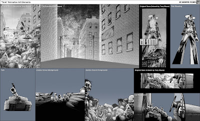
This is the director I have been in contact with that Tim McLean told me about. I have had great communications with Tim and after I explained my project to him he sounded very interested. He gave me loads of background information on the plot and characters and has been a great help to my research so far. This being said, he has also helped me move on. After telling me about Jon Maxwell I then sent him an email telling him who I was and my plans for my Major Project. He got back in touch with me a couple of days after saying how he thought my project sounded interesting. I sent him my showreel which he looked at and asked if I wanted to collaborate with him and his team on his film! What an opportunity!!!

He wants to enter his short film into competitions all over the world so if I got my work on the film and my name in the credits it would be great for me just starting out and going into the industry. It would be a great thing to have on my CV and in my portfolio. I'm looking forward to working with Max and his team and hopefully the project should be a good one.

Here is some of Jon's (Max's) Past Projects...


One Night in LA


Laura
Walking Dead Titles, Daniel Kanemoto


Romantically Apocalyptic

Recently I was shown this web comic called Romantically Apocalyptic. It's not the style that I want to replicate the direction in which I was thinking of heading but I have put this extract up here to show how I could use my own footage/photography and develop it in photoshop and after effects. I can create the settings and compositions I want and change it to my needs. I like the dark lighting are dark nature of this strip but I think it is too dark for my narrative.

[Click to Enlarge]

Dan McCarthy

When coming to look at different style to create my title sequence I looked at many different medias to look for inspiration. Recently I have been looking a lot at illustrators to get inspiration. I came across this guy called Dan McCarthy and loved the way he used silhouettes within his work to create landscapes such as these below. As I want to do some to do some compositing within my final major. I could have the opportunity of using backgrounds like these with other mediums animating in from of it. I like the use of silhouettes and they featured in a lot of my work in my foundation work.

Homeward Bound

I especially like this piece as it reminds me a lot of the story "Fall North" and the last line of the piece:

"The trees hurtling by were at peak colour, like in postcards."

Its the fact its the end of the story and in the piece the car is driving into the distance with the autumn colours filling the sky. I like that fact it is dusk too as it is the sun setting on the story.

Some other examples:


A Plane Passed Silently Overhead


It Felt Good To Be Lost

A Kiss From Tokyo, Kevin Dart


In my sketchbook I have spoken about Kevin Dart and his fake movie trailer. This is that movie trailer which is in-fact advertising a character from a series of books. This is similar to the Richard Montanari Ads that I showed earlier on my blog but these are a bit more creative in the way they have been approached. I like the use of 2D media to create the composition. The grading they have used is very similar to some the classic titles we have seen in the past. A large influence for these titles was the titles from the James Bond series of films. I like the way they have given it a vintage look with the coloured layers over the footage as well as the rounded corners which suggests it is more like a 13mm piece of footage or/and something projected.

James Bond Poster


Making of "A Kiss From Tokyo"


Titles Grading

Film grading to create vintage look.

After Effects structure of the outcome

The Hostage Title Sequence + Sin City


I mentioned this in my last post as well as the titles in Sin City. This is now consider a very obvious way to show the noir crime genre. I've looked at doing it in this style but thought it was to close to these other examples. I don't want to seem like I'm copying someone else's style because I want to create my own style which ties into the story itself. I wanted to get away from the spot colour, Frank Miller style imagery and the heavy use of colours such as red to set the mood. Mood can be set in a verity of ways and it doesn't have to be done this way. One thing I really like about this piece though is how the names are arranged around the composition and being discovered as the camera moves through. It reminds me very much of methods used in my last titles that were influenced by the titles for the french film Delicatessen.

Below are 2 tests I did before I made this decision of finding my own style and trying to get away from the typical imagery used in these types of films and programs.

Test 1


Test 2

Here is another test that I produced in a similar style to this title sequence but focusing on the idea of "Fall" (autumn) which is spoken about in the short Fall North. I wanted to try an array of ideas to see which best suits the story.


Richard Montanari Book Ad


These are 2 videos produced to advertise novels written by Richard Montanari. He writes crime thrillers and has had these produced to get the readers visually excited and set up the mood. It is a great idea. These are by no means the best examples and the best produced but I like the idea of a ad advertising something a little different. Something you don't see everyday.

Broken Angels is a sponsor advertisement for in the breaks on the FX Channel as they show crime dramas. It is appealing to the crime audience when it knows they are going to be watching. It is done in a similar style to the Sin City and The Hostage titles. This is a style that is closely related to the crime / thriller genre and immediately the audience take note when they see the style.

I'm not wanting to replicate this style is I think it is too obvious and not right for the piece I am designing for. I feel I need to find and develop a style which is a little more subtle but still sets up the viewer for what they are about to see.