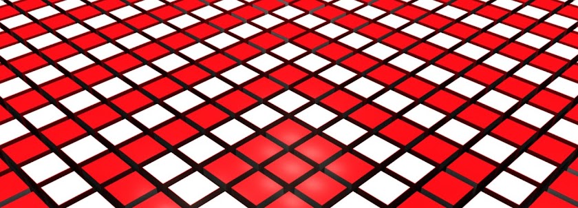
These are the style frames I have come up with for my approach to the Fall North Titles. I focused one one of the angles I found when animating the titles for Jon Maxwell and then treated the image to get that grungy, dirty, gritty feeling much like the "Walking Dead" stuff I looked at earlier in the project. That was the style I wanted to stick with and that was the stylised look Jon Maxwell wanted to go back to towards the end of working with him.
When thinking of producing a body of work I was going to make a series of posters and postcards so I could create the identity for the film based on the titles and the type I have decided to use. This image could be great for a poster and I think could be an ideal image to advertise the film. It gives you a sense of mood for the film and obviously the location but without giving anything away of the film. This is what I want and this is ideally what is needed for a film poster. Something that would stand out as well as being memorable

First draft


No comments:
Post a Comment